Promo codes
Intuitive and delightful promo redemption to increase Free to Premium subscription conversion
Product area
Web and mobile app
Growth
Focus
UX/UI design
User research
Tools
Figma
UserTesting
Overview
With MyFitnessPal’s mission to help people reach their health and fitness goals, I had three main goals in mind when redesigning our promotion redemption flow:
1. Expand our Premium member base
2. Enable users to easily redeem premium membership discounts and
3. Understand the value of Premium benefits. This project resulted in a redesign of the promotion redemption and checkout experience, reducing the # of clicks and solving for the cross platform experience.
Problem
Promo code redemption is cumbersome and confusing for users.
Users do not understand the value of a promotion as it applies to a premium subscription
Users are unaware of premium features and subscription details (length, renewal, etc.)
We want to increase promo code redemption to improve value to users, granting access to the full suite of MFP features
Marketing and corp development teams have no way to offer lower-cost promotions to users
Solution
The final result was an overall redesign and streamlining of the promotion redemption flow, solving for several problem areas:
Updating web compliance in regards to payment processing
Updating the standard conversion funnel
Modernizing the checkout experience
Aligning with current brand standards and modernize look and feel
Reducing # of clicks and pages, addressing the high drop-off rate
Minimize web footprint for engineering team by consolidating 2 flows, # of pages
Improving the cross-platform experience: from email to app
Fig 1. Audit of current flow and user behavior
Audit
Examining the current flows on mobile/desktop app, I discovered several problem areas:
Overall, disjointed experience
User must be already logged in
Redundant steps to apply the promotion code, which is the primary action and goal
2 separate flows (payment required vs. payment not required) to achieve the same goal
Difficult to navigate. Can’t go back or the flow will break
No expectation setting of:
Premium/features
Promo info / trial info / payment / confirmation
How many steps there are
Post-redemption/checkout experience
Mobile web is not responsive at all
Inconsistent and outdated design
Lack of consistency - design, buttons, type, headers
Outdated designs, colors, components
Does not feel modern and legitimate
Lack of helpful troubleshooting
No consideration for cross-platform flow between email - web - mobile app
Lack of celebratory moments
Additionally, data showed a ~26% drop-off rate between the promo application page and the checkout page.
Fig 2. Visual audit of redemption flow (mobile web) in which payment is not required
Competitive research
User research
Looking at modern promotion redemption and checkout experiences, I found common themes of:
Typical flow: Email/paid media → promo landing page → registration
Lots of context: Value prop, premium offerings, discount value
Confidence-inspiring payment processing and confirmation
I worked with the UX Researcher to write the testing plan to identify user pain points with the current experience.
User feedback:
Simple process, confusing content
Outdated design
Confirmation is important
Need for reminders of subscription expiration
Expecting immediate access to premium features
Navigational elements confusing
People are excited about promo codes!
Flow redesign
Based on audit and research findings, I proposed several flow redesign directions, including:
The addition of a promotion landing page to serve up seasonal content and campaigns,
Redirection to checkout with automatic or manual application of the promo code, or
Creating a unique login page to expectation-setting and marketing content.
Fig 3. Unified flow, consolidating the diverging experience of payment vs. no payment required
Furthermore, I wanted to reduce the number of clicks, steps, and pages required to redeem a promo code and purchase a premium subscription, as well as streamline the cross-platform experience, taking into consideration users receiving codes in emails on their phones, being redirected to mobile web, and expecting immediate Premium access on their mobile apps.
Based on stakeholder feedback, tech constraints, and business objectives we narrowed down to one flow option.
Wireframing
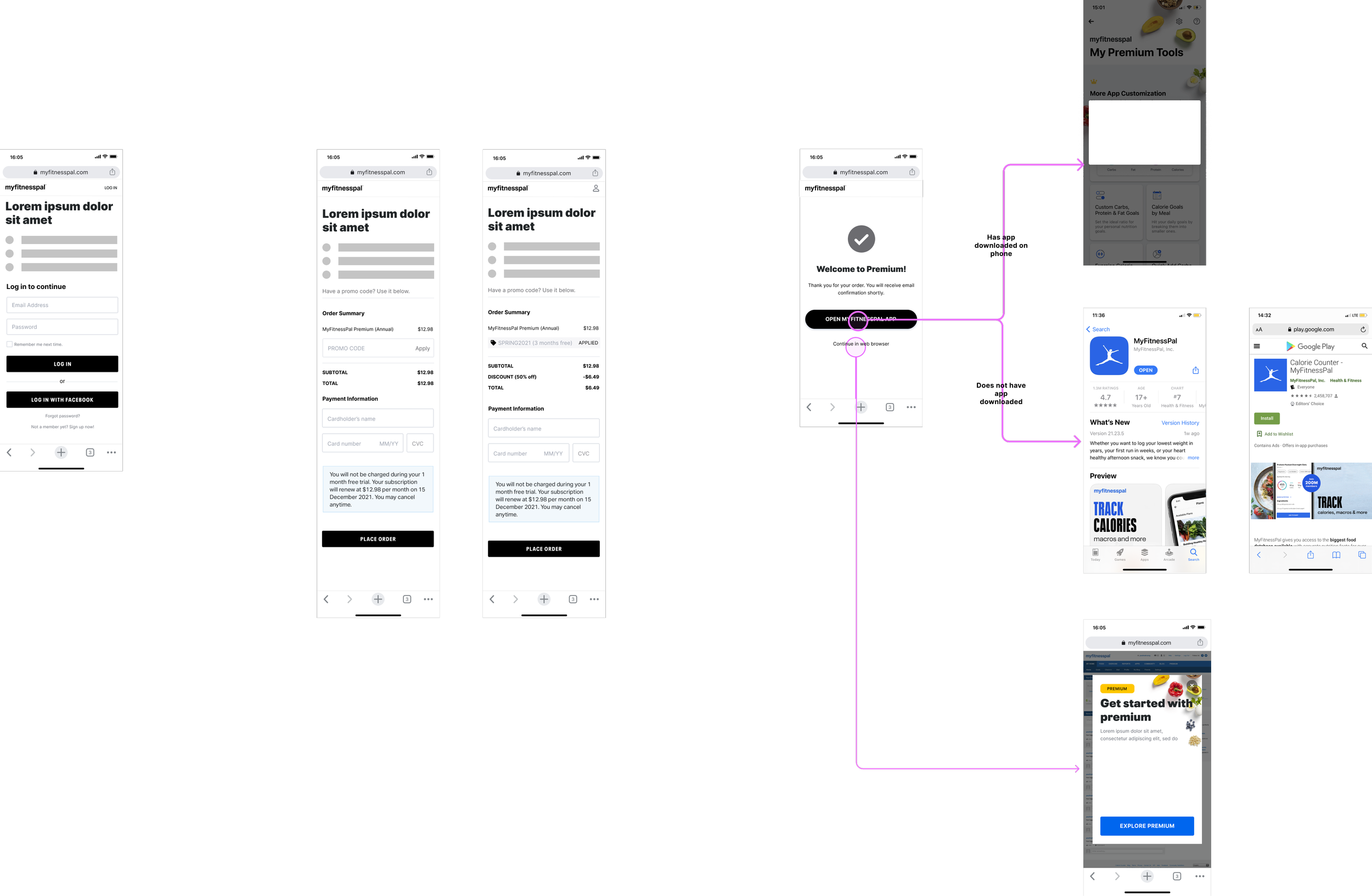
I then designed wireframes based on further feedback on this flow, particularly focusing on the promo application behavior and the experience following payment confirmation.
Fig 4. Wireframes for mobile and desktop
Visual design
Working with the visual designer, we focused on several areas:
Generating dynamic content based on the promo code
Application of the code + checkout
Creating an informative experience and look/feel
Confidence-inspiring confirmation
Legal/compliance
Defining new pattern for Stripe single payment input
Defining error states for checkout
Aligning with current brand standards
Before and afters
Fig 5. Application of updated visual branding
Defining error messaging
Fig 6. Defining error message requirements
Learnings
Strong collaboration with research, writing, and engineering was necessary to provide a seamless and clear experience for users.


